Navigation
A Closer Look at the Echo2 Framework
Introduction
Some of the readers of my previous review of the Echo2 framework expressed concern that I didn't write a complex enough application to give it a fair shot. Fair enough, I just finished writing a new web application using the Echo2 framework, complete with input validation and database access using Hibernate for object-relational mapping. This article summarizes my experiences with the Echo2 framework.
The Environment
To code the application, I used Eclipse 3.1 as my IDE, using Joe Hudson's excellent Hibernate Synchronizer Eclipse plugin to help me with the data access code, JDK 1.5 for AMD 64, the RDBMS is PostgreSQL 8.0.3, everything running under the 64 bit version of Fedora Core 4. Tomcat 5.5.9 was used as the servlet container.The Application
 The
requirements for the application are to allow the user to enter a
customer's name and address, making sure the user enters data for all
required fields. The application must notify the user when attempting to
save data with required fields missing. Once the data is saved, the
application must retrieve the data from the database, and show the user
a confirmation page displaying the data just entered.
Even though the test application is not enterprise class software (it was written by a single developer in three evenings, after all), it gives a better idea of what to expect when coding "real" applications using the Echo2 framework.
I took some liberties to simplify the test application, these liberties don't affect the UI coding aspects of it, they just simplify the logic, allowing me to focus on evaluating the Echo2 framework.
- The application does not do any format validation, it only checks to see if required fields have values.
- The application only accepts US addresses.
- Since I intended to deploy the application as a live demo, there is no search capability in the test application. I have no control of what data will be entered into the test application, and I don't want anyone to be offended by any colorful language that might be entered into the database.
When coding the application, I added a "status label", or a notification area where I would send notifications for debugging purposes. I intended to remove it after I finished writing the application, however, since it showcases the dynamic behavior of Echo2 applications, I decided to leave it there.
The Good
There are absolutely no page refreshes in an application developed with Echo2, making these applications very responsive. The applications combine the responsiveness of desktop application with the ease of deployment of web applications, combining the best of both worlds.
The Bad
Laying out components could be easier. For the test application, I wanted to lay out the components the way the vast majority of web based forms are layed out, two columns, the left column containing right aligned labels, and the right column containing left aligned data entry components. Echo2 has a Grid component that seemed perfect for this, however the documentation recommends to stay away from it for performance reasons. Looking at the documentation, I found a Table component, I tried using it for laying out the test application, that unfortunately didn't work, since the Table component does not render any components it contains, instead it displays the output of the toString() method of those components. With the two obvious choices out, I looked around the documentation, and noticed Echo2 has two more components used for laying out other components, called Row and Column. The Row components lays out the components it contains in a single row, the column components lays them out in a single column. I figured that if I added two Columns to a row, then placed all the labels on the left Column, and all the data entry components to the right column, I would achieve the desired layout. Unfortunately it didn't work out that way.Every component in a Column would have different heights, the labels and the data entry fields were not aligning correctly. To get around this, I changed the size of the font for the labels, making it bigger, this trick resulted in the labels aligning correctly with their corresponding data entry fields. This technique worked properly (at least on Firefox), but it was a lot of work. Perhaps I should have used the Grid component and live with the performance penalty.
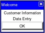
Another downside I found is that there is no way to center the popup windows that can be created with the framework (like the one depicted at the beginning of the "The Application" section above), leaving the programmer to guess where to place it, based on the average resolution and browser window size of the users.
The Ugly
Like I mentioned before, I was developing the application on a Linux laptop, testing it on Firefox as I went along. Shortly before publishing the article, I realized I hadn't tested the application on that other browser 90% of the population uses. Boy was I up for a surprise. I could describe how it looked, but, like the old saying says, a picture is worth a thousand words: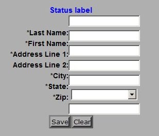
I didn't modify the code, therefore if you run the test application on IE, that is what you will see.
Updates:
- Some readers have pointed out that the test application does not render correctly on Firefox under windows either.
- Tod Liebeck, one of the main developers ot the Echo2 framework, emailed us to let us know that the Grid component was the most appropriate for the layout we wanted. After following Tod's recommendation, the application renders correctly on IE, Firefox on Windows, and (of course) Firefox on Linux.
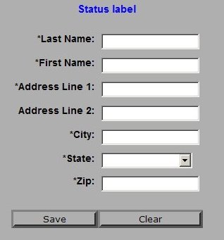
Here is how the original test application renders on Firefox on Linux:
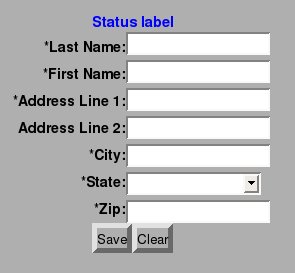
It would have been nice if Echo2 took care of browser differences behind the scenes. Old problems never die.
Tips
When writing the test applications, I found a few "gotcha's" that took some time to figure out, I will list them here to save any potential future Echo2 developers some time:- Every method call to a class extending ApplicationInstance must end by setting the content of the main application window to a pane, otherwise Echo2 will complain about an "application error" with no details in the logs or anywhere else.
- Every time a new version of the application code is deployed, the browser's session needs to be cleared, otherwise the browser will still use the old version of the application.
Conclusions
Writing applications using the Echo2 Framework is very different from writing applications using other Java web application frameworks like Struts or JavaServer Faces, Echo2 application development feels more like writing a desktop application, rather than a web based one. Whether this is good or bad is a matter of personal preference.Laying out components could be easier, but the responsiveness of the resulting applications is hard to beat. As far as I know, no other framework currently makes writing AJAX based applications so easy.
Echo2 is better suited for intranet based applications where the browser used to access it can be controlled. For these type of web applications, Echo2 is definitely worth a look when evaluating web application frameworks.
Resources
- Echo2 Website - has demos, downloads, JavaDoc and an excellent tutorial.
- NextApp Website - NextApp is the company behind Echo2.
- Echo Forums


